8 UX Mistakes Quietly Killing Your App’s Retention Rate
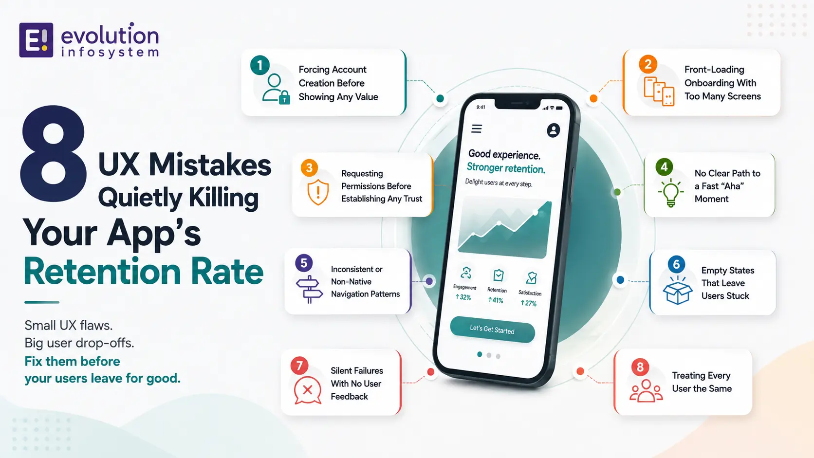
Most teams treat a bad retention number as a marketing problem. More users, better targeting, a sharper onboarding email sequence. Sometimes that’s true. But in a lot of the apps I’ve looked at over the years, including several we’ve audited at Evolution, the real issue was sitting in the product itself: a handful of app UX design mistakes nobody had gone back to question since the first version shipped.
Industry data backs this up in a fairly blunt way. Most published benchmarks put Day-30 retention somewhere in the single digits for the average app, meaning the overwhelming majority of users who download an app stop using it within a month. Some of that is inevitable churn. A meaningful chunk of it is self-inflicted, caused by specific, fixable UX decisions.
This isn’t a listicle of generic “make onboarding better” advice. These are eight specific app UX design mistakes that show up again and again, why they quietly erode retention even when nothing looks obviously broken, and what a better version actually looks like.
Worth noting upfront: these patterns show up across categories- consumer apps, B2B tools, marketplaces- because the underlying psychology, how people react to friction, confusion, and unclear value, doesn’t change much based on what the app actually does. The specific fix might look different for a fintech app versus a fitness app, but the underlying mistake is usually the same one.
One more thing worth saying before diving in: this isn’t a “your app is bad” list. Most of these mistakes show up in genuinely well-built, well-funded products, made by teams who care deeply about the experience. They’re not signs of carelessness so much as signs of proximity, it’s simply hard to see friction in a product you already know inside and out.
The Eight Mistakes at a Glance
| Mistake | What It Costs You | Fastest Fix |
|---|---|---|
| Forcing signup before value | First-session abandonment | Guest access or delayed registration |
| Overloaded onboarding | Cognitive fatigue, early drop-off | Progressive disclosure |
| Early permission requests | Declined permissions, distrust | Contextual, just-in-time requests |
| Slow time-to-value | Users leave before the “aha moment” | Map and shorten the path to first value |
| Non-native navigation | Ongoing friction, relearning cost | Follow platform conventions deliberately |
| Poor empty states | Silent confusion for new users | Design empty states as first-class screens |
| Silent failures | Eroded trust | Specific, actionable error messages |
| Treating all users the same | Irrelevant messaging, missed re-engagement | Basic behavioral segmentation |
Keep this table as a quick reference while reading the detail below, since a few of these mistakes interact with each other in ways that make fixing them together more effective than tackling them one at a time. A slow time-to-value, for instance, often gets worse when paired with an overloaded onboarding sequence, since both problems delay the same moment a new user needs to reach.
Why “It Looks Fine” Isn’t the Same as “It Works”
Before getting into the list, it’s worth naming the trap most teams fall into: an app can look polished, pass every design review, and still bleed users because of decisions that only show up as a problem in aggregate behavioral data, not in a single screenshot.
This is exactly why app UX design mistakes are so easy to miss internally. The team that built the app already understands it. They know where things are, what the icons mean, why a screen behaves the way it does. A first-time user has none of that context, and that gap is where most retention damage actually happens.
Design reviews, by their nature, tend to happen with people who already understand the product deeply. That’s precisely the population least equipped to notice friction a genuine first-time user would hit immediately. It’s not a failure of the review process, it’s just a structural blind spot that requires actively working around, not something a more careful review alone can fix.
Mistake 1: Forcing Account Creation Before Showing Any Value
Why This Kills First Impressions
Asking someone to create an account, verify an email, and set a password before they’ve seen anything the app actually does is one of the most common and most damaging app UX design mistakes still in wide use. You’re asking for commitment before you’ve demonstrated anything worth committing to.
Users increasingly expect some form of low-friction entry, guest access, social login, or a genuine “try before you sign up” path, before being asked to formally register. Apps that reduce this specific friction point tend to see meaningfully better onboarding completion than apps that gate everything behind a signup wall.
Think about the difference between a shopping app that lets you browse the entire catalog, add items to a cart, and only asks for an account at checkout, versus one that demands an account before you can see a single product. Both eventually need the same information from a converting customer, but the first version lets a browsing, not-yet-committed user actually experience the product before being asked for anything.
What a Better Pattern Looks Like
Let people experience the core value proposition first, then ask for account creation once they’ve had a reason to want to save their progress or come back. A recipe app that lets you browse and even cook from a recipe before asking you to sign up converts very differently than one that puts a login wall on the home screen.
If your business genuinely needs an account for legal or operational reasons, financial services being an obvious example, the fix isn’t removing the requirement, it’s being upfront and specific about why it exists at that exact moment, rather than presenting it as an arbitrary gate.
Mistake 2: Front-Loading Onboarding With Too Many Screens
The Cognitive Fatigue Problem
Walking a new user through five, six, or seven tutorial screens before they can touch the actual product is a classic example of app UX design mistakes made with good intentions. The team wants users to understand every feature. The user just wants to get to the thing they downloaded the app for.
Long onboarding sequences increase cognitive load at exactly the moment a user has the least patience for it. They haven’t invested anything yet. There’s no sunk cost keeping them engaged through screen four of an explanation they didn’t ask for.
I’ve seen teams A/B test a seven-screen onboarding tour against a two-screen version that dropped users straight into the product with a few contextual tooltips, and the shorter version consistently won on completion rate. The extra “education” in the longer version wasn’t actually teaching anything the contextual tooltips couldn’t teach better, at the moment it was actually relevant.
Progressive Disclosure Instead of Front-Loading
The more durable pattern is progressive disclosure: teach people about a feature the moment they’re about to use it, not three screens before they’ve opened the app for the first time. A tooltip that appears the first time someone taps a specific icon teaches more effectively than a slide explaining that icon exists, shown before the user has any context for why it matters.
Mistake 3: Requesting Permissions Before Establishing Any Trust
Why Early Permission Requests Backfire
Asking for location, contacts, camera, or notification access in the first thirty seconds, before a user understands why the app needs it, is one of the fastest ways to trigger a decline, and a declined permission early in the experience is hard to walk back later. This is a genuinely avoidable item on the list of app UX design mistakes, since the fix is almost entirely about sequencing, not removing functionality.
Once a user declines a permission, re-prompting them requires either a system-level settings change on their part or a genuinely compelling reason to ask again, both of which are considerably harder to achieve than simply asking at the right moment the first time.
Contextual Permission Requests
Ask for a permission at the exact moment its value is obvious. Request location access when a user taps “find stores near me,” not on first launch. Request notification permission after a user has completed an action that notifications would genuinely enhance, not as step two of a generic onboarding flow. The permission itself isn’t the problem; the timing is.
Mistake 4: No Clear Path to a Fast “Aha Moment”
Time-to-Value Matters More Than Feature Count
Every app has some specific moment where a new user genuinely understands why the product is useful to them. The apps with strong retention get users to that moment fast. The apps with weak retention bury it behind setup steps, empty states, or a UI that doesn’t make the path to that moment obvious.
This is one of the app UX design mistakes that’s hardest to spot from the inside, because the team already knows what the “aha moment” is and assumes it’s equally obvious to a first-time user. It rarely is.
A project management app’s aha moment might be “seeing your first task move across a board.” A fitness app’s might be “seeing your first workout logged and visualized.” If a new user hasn’t reached that specific moment within their first session, the odds of them returning drop sharply, regardless of how many other features the app offers.
Mapping Your Own Time-to-Value
Sit down and honestly map how many taps, screens, and decisions stand between app open and that first moment of genuine value for a brand-new user. If the number is high, that gap is very likely costing you retention, even if every individual screen along the way looks perfectly fine in isolation.
Mistake 5: Inconsistent or Non-Native Navigation Patterns
Fighting Platform Conventions
Building custom navigation patterns that ignore iOS or Android platform conventions is a subtler entry on this list of app UX design mistakes, but it compounds over the life of an app. Users bring expectations from every other app they use daily. Fighting those expectations with a clever, custom gesture or an unconventional tab structure adds friction that most teams underestimate.
This shows up most often when a design team ports a web-first mental model directly into a mobile app, treating navigation like a website’s menu structure rather than respecting the tab bars, gesture conventions, and back-navigation patterns users already know from every other app on their phone.
When Custom Navigation Is Worth It
This isn’t an argument for never innovating on navigation. It’s an argument for doing it deliberately, with a genuine reason, rather than accidentally, because nobody checked the design against standard platform patterns before shipping. If your navigation is unconventional, make sure it’s unconventional because it’s genuinely better for your specific use case, not simply different.
Mistake 6: Empty States That Leave Users Stuck
The Overlooked Screen
Every app has moments where there’s genuinely nothing to show yet: a new user’s empty inbox, an empty dashboard before any data exists, a search with no results. These empty states are consistently under-designed, often left as a generic “nothing here” message with no clear next step.
This is one of the app UX design mistakes that costs retention silently, because it hits exactly the users who are earliest in their relationship with your app and have the least invested reason to push through confusion on their own.
A blank dashboard with no guidance reads as “this app doesn’t have anything for me” to a brand-new user, even when the actual explanation is simply “you haven’t added any data yet.” That distinction is obvious to the team that built the app and completely invisible to someone opening it for the first time.
Designing Empty States as a First-Class Screen
Treat every empty state as a genuine design opportunity, not a fallback. Tell the user specifically what to do to fill that screen with real content, and ideally give them a single clear action to take right there rather than making them figure out the path on their own.
Mistake 7: Silent Failures With No User Feedback
Why Silence Feels Broken
When something goes wrong, a failed form submission, a network timeout, a payment that didn’t process, and the app gives no clear indication of what happened, users assume the app is broken. They don’t distinguish between “the app crashed” and “the app quietly failed without telling me.” Both read as untrustworthy.
This is a particularly damaging entry among common app UX design mistakes because it directly erodes trust, and trust is expensive to rebuild once a user starts wondering whether the app actually did what they asked it to do.
A payment app that shows no confirmation, no error, nothing, after a user taps “submit” creates genuine anxiety: did the payment go through twice? Not at all? The user is left guessing, and guessing about money is exactly the kind of experience that drives someone to delete an app and look for an alternative.
Clear, Specific Error Feedback
Every failure state needs a clear, specific message, not a generic “something went wrong,” along with a next step: retry, contact support, or an explanation of what actually happened. Vague error messages solve the technical problem of not crashing while leaving the actual user experience problem completely unaddressed.
Mistake 8: Treating Every User the Same
The Cost of Generic Experiences
A brand-new user and someone on their fiftieth session have completely different needs, yet a lot of apps show both groups an identical experience. Generic messaging, generic onboarding shown every time, generic feature promotion, all underperform something even lightly tailored to where a specific user actually is in their relationship with the app.
This is the most structurally difficult of the app UX design mistakes to fix, since it usually requires genuine behavioral segmentation rather than a single design change, but it’s also one of the highest-leverage fixes available once you have the data to support it.
Showing a returning, highly engaged user the same “welcome, here’s how this works” prompt they’ve already dismissed a dozen times signals that the app isn’t paying attention to their actual behavior, which is a small but real drag on the relationship over time.
Starting Simple With Segmentation
You don’t need sophisticated personalization to start. Distinguishing between “first session,” “returning but not yet activated,” and “regular user” is often enough to meaningfully improve how relevant your onboarding, messaging, and feature prompts feel to each group, without building a complex personalization engine from scratch.
A Composite Example: How These Mistakes Stack Up
Walking Through a Typical First Session
It’s worth seeing how these issues compound in a single session, since that’s usually how they actually cost you a user, not in isolation but stacked on top of each other. Picture a new user downloading a budgeting app. They open it and immediately hit a full signup form, no guest option. They push through it anyway, curious enough to try.
Once inside, they’re shown six onboarding screens explaining every feature before they’ve connected a single account. On screen three, the app asks for notification permission with no explanation of why. They decline, mildly annoyed. Finally reaching the dashboard, it’s empty, no data, no clear next step, just a vague “add your first account” button with no explanation of what that actually involves or how long it takes.
They try anyway, hit a connection error linking their bank, and see only a generic “something went wrong” message with no retry option or explanation. At this point, a meaningful share of users close the app and don’t come back. Nothing about this experience was catastrophically broken. Every individual screen would probably pass a design review. But five smaller app UX design mistakes, stacked together in a single session, add up to a genuinely bad first impression and a lost user.
Why Stacking Matters More Than Any Single Mistake
This is the pattern worth internalizing: these eight mistakes rarely show up in isolation in a real product. They tend to cluster, since a team that hasn’t questioned its signup flow often hasn’t questioned its onboarding length either, and a team that hasn’t designed thoughtful empty states often hasn’t invested in specific error messaging either. Fixing one in isolation helps, but auditing for the full set tends to reveal a genuinely different, much stronger first-session experience once addressed together.
How to Actually Audit Your Own App for These Mistakes
A Practical Starting Point
Rather than guessing which of these eight issues apply to your app, watch real, unscripted users go through your onboarding and first session, ideally without any hints or guidance from your team. The places where they hesitate, ask questions, or give up are exactly where these app UX design mistakes tend to live.
Pair this with your actual retention data broken down by cohort and day, not just an aggregate number. A steep drop specifically between Day 1 and Day 7, for instance, points toward a different set of these mistakes than a steady decline stretched across thirty days.
Watching five real users struggle through the same specific screen tells you more than any internal design review ever will, simply because your own team can no longer see the app the way someone encountering it for the first time does. This is worth treating as a recurring practice, not a one-time exercise, since new features and screens introduce new opportunities for these same mistakes to creep back in.
Why Fixing These Mistakes Matters More Than Chasing New Users
The Math Most Teams Skip
Acquiring a new user costs money, whether that’s paid ads, App Store optimization work, or organic growth effort that still takes real time. If a meaningful share of those hard-won users churn out within the first week because of an avoidable app UX design mistake, you’re effectively paying acquisition cost for users who were never going to stick around long enough to generate value.
This is why fixing onboarding and first-session friction tends to have such an outsized return relative to the effort involved. You’re not spending anything to acquire the users who are already there, you’re just stopping the leak that’s currently pushing a chunk of them back out the door before they ever had a real chance to become regular users.
Retention Compounds, Churn Compounds Too
A small improvement in Day 1 or Day 7 retention doesn’t just help that specific cohort, it compounds across every future cohort going through the same improved experience. The inverse is also true: a persistent app UX design mistake keeps quietly taxing every new cohort that comes through your onboarding, month after month, until someone actually fixes it.
This compounding effect is part of why it’s worth treating a UX audit as a genuine, recurring practice rather than a one-time cleanup project, similar in spirit to how a broader product modernization effort benefits from periodic review rather than a single upfront push. New features tend to reintroduce small versions of these same mistakes if nobody is actively watching for them.
A Note on Platform Differences
iOS, Android, and Web Each Have Their Own Failure Modes
While the eight mistakes covered in this guide apply broadly, the specific way they show up varies by platform. iOS users have different expectations around permission prompts, given Apple’s own system-level permission UI, compared to Android users navigating a more customizable but sometimes less consistent permission flow.
Web apps face a different version of the empty-state and onboarding problem entirely, since there’s no app store review process forcing a baseline level of polish before launch, and users can bounce with a single click rather than needing to actively delete an installed app. If you’re building or maintaining a cross-platform product, it’s worth auditing each platform’s specific instance of these mistakes separately rather than assuming a single fix applies uniformly everywhere.
Progressive web apps and hybrid frameworks add another layer of nuance, since they often inherit some native-feeling conventions while still behaving differently from a fully native app in ways users notice even if they can’t articulate exactly why. A navigation pattern that feels perfectly native in a React Native app might still feel subtly “off” compared to a fully native iOS or Android equivalent, and that subtle friction can matter more than it seems like it should.
Frequently Asked Questions
What is the biggest UX mistake that hurts app retention?
Forcing users through a lengthy signup or onboarding process before they’ve experienced any real value tends to cause the steepest early drop-off. Getting a new user to a genuine “aha moment” quickly is consistently one of the highest-leverage fixes available.
How much does onboarding actually affect retention?
Onboarding quality is one of the most significant factors in early-stage churn, with a meaningful share of total customer loss happening within the first days to weeks of use. A structured, low-friction onboarding experience consistently outperforms an unstructured or overloaded one.
Should apps ask for permissions during onboarding?
Generally no, not upfront. Requesting permissions like location, contacts, or notifications before a user understands why they’re needed tends to produce declines that are hard to reverse. Asking at the specific moment the permission’s value is obvious performs meaningfully better.
What’s a good Day 1 retention rate for a mobile app?
Benchmarks vary by category, but current industry data generally puts a solid Day 1 retention rate in the range of 25 to 30 percent, with anything meaningfully higher considered strong performance. Retention drops off substantially by Day 30 across almost every app category.
Do empty states really affect retention?
Yes, particularly for new users. An empty state with no clear next step leaves exactly the users who are least invested in your app to figure things out entirely on their own, which is a common point of silent drop-off that rarely shows up as an obvious complaint.
How do I know which UX mistakes are actually hurting my app?
Combine qualitative observation, watching real users navigate your app without guidance, with quantitative cohort-level retention data. The two together usually point clearly at specific screens or moments where users are struggling, rather than requiring you to guess.
Is personalization necessary for good app retention?
Not full personalization, but some level of segmentation helps significantly. Even a simple distinction between new, returning-but-not-activated, and regular users lets you tailor messaging and onboarding meaningfully without building a complex system.
Can fixing UX mistakes really move retention numbers, or is it mostly about the product itself?
Both matter, but UX issues are often the more fixable, faster lever. A product with genuine value can still lose a large share of users purely to friction, confusion, or poor first-session design, meaning UX fixes frequently show measurable retention improvement without any change to the core product itself.
How long does it typically take to see results after fixing onboarding UX?
Because onboarding affects every new cohort immediately, improvements often show up in Day 1 and Day 7 retention data within a few weeks of shipping the fix, assuming you have enough new user volume to see a statistically meaningful shift. Longer-term Day 30 and beyond metrics take correspondingly longer to reflect the change, simply because you need a full cohort to age through that window.
Final Thoughts
None of these eight app UX design mistakes are exotic or hard to understand once you see them named. That’s part of why they’re so common: they’re easy to overlook precisely because they seem minor in isolation, a few extra onboarding screens here, an early permission request there, a generic empty state nobody got around to designing properly.
The retention cost adds up in aggregate even when no single decision feels significant on its own. If you’re trying to figure out which of these is actually costing your app the most, start with real user observation and real cohort data rather than guessing, and fix the highest-friction moment first rather than trying to overhaul everything at once.
It’s also worth resisting the temptation to treat this as a one-time cleanup sprint. New features, new screens, and new team members all create fresh opportunities for these same eight patterns to quietly reappear, even in a product that was genuinely clean six months ago. Building a habit of periodically watching real users, rather than relying purely on internal review, is what keeps these mistakes from creeping back in over time.
If you take one thing away from this guide, let it be this: the fix for most of these issues isn’t more features or a bigger redesign, it’s usually removing friction from a path that already exists. That’s a genuinely different, and often cheaper, kind of work than most teams assume when they first start looking at a weak retention number.
We’ve worked through this kind of UX audit process with product teams at Evolution, usually starting with the same question: where, specifically, are new users actually getting stuck? If you want a second set of eyes on your own onboarding and retention numbers, that’s a conversation we’re glad to have.